How to Mix Marble Colors Without It Looking Chaotic — Designer Rules Explained
Mixing marble colors is one of the most rewarding things you can do in an interior — and one of the easiest to get wrong. The difference between a room that looks deliberately layered and one that looks like an auction house preview comes down to a small set of principles that interior designers apply consistently. Here they are.
Why Mixing Marble Colors Works — When It Works
Natural marble is not a single material with a single look — it is a family of stones that share a common language of veining, depth, and geological character. When you mix marble colors thoughtfully, you are working within that language. The result reads as naturally varied rather than randomly assorted, the same way a room with different wood tones in the same warm family reads as layered rather than mismatched.
Rule 1: Anchor with One Dominant Stone
Every successful mixed-marble interior has one stone that does most of the work — the anchor. This is the stone you use for the largest or most-used pieces: the kitchen accessories, the chess board, the bathroom tray. The other stones are accents — used for one or two smaller pieces that complement without competing. A kitchen anchored in White Carrara (mortar, coasters, cake stand) can carry a single green onyx piece (a candle holder, a decorative object) without conflict. The ratio matters: roughly 70% dominant stone, 30% accent.
Rule 2: Vary Tone, Not Temperature
The most reliable way to mix marble colors without chaos is to stay within a single temperature family. Warm stones — honey onyx, brown beige, red marble — mix naturally with each other. Cool stones — white Carrara, black marble, grey marble — mix naturally with each other. Mixing warm and cool stones in the same room is the most common source of a disjointed look. The exception is black and gold marble, which is warm enough in its gold tones to bridge the two families when used sparingly.
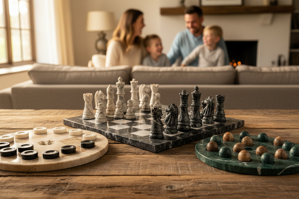
Rule 3: Vary Scale, Not Color, in the Same Zone
Within a single surface — a kitchen counter, a desk, a bathroom shelf — use only one marble color, but vary the scale of the objects. A large marble mortar, a medium marble salt cellar, and a small marble spoon rest: three different sizes, one stone, one surface. This creates visual interest through proportion rather than color contrast, which reads as composed rather than cluttered.
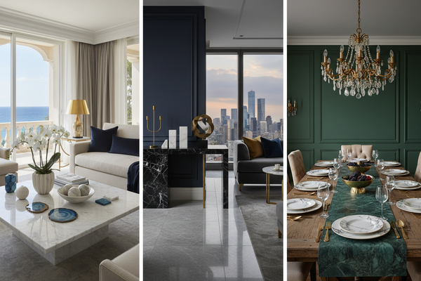
Rule 4: Let Color Contrast Happen Between Zones
Reserve marble color contrast for different rooms or different parts of a room. White Carrara in the kitchen, honey onyx in the bedroom, black marble on the desk — each zone has its own stone identity, and the contrast between zones is interesting rather than competing. Walking from room to room and encountering different marble stories is a mark of a considered interior.
Combinations That Always Work
- White Carrara + Black Marble: The classic contrast. Use Carrara for kitchen and bathroom pieces, black for office and barware. Never mix them on the same surface.
- Honey Onyx + Brown Beige: Two warm stones in the same tonal family. Layering these creates depth without contrast — ideal for a warm, organic interior.
- White Carrara + Green Onyx: The most dramatic combination. Keep Carrara as the anchor (80%) and green onyx as a single statement piece (20%).
- Black Marble + Black & Gold: Two dark stones with different accent tones. Sophisticated and cohesive in a dark interior.
Explore all Artreestry stone colors in the Marble Color & Stone Guide, or browse the Interior Design Inspiration Hub to see how pieces live in real rooms. Use code ARTREE10 for 10% off your first order — free shipping on all orders over $200.
Ready to bring this into your home? Explore Artreestry's full handcrafted marble collection.
Shop the Collection